

In 1810, as Europe was swept up in the aftermath of the Napoleonic Wars, a quiet revolution in understanding human perception was taking shape in a German study. The scientific community stood at the edge of a breakthrough that would reshape our understanding of how colors influence human behavior and decision-making.
Johann Wolfgang von Goethe, better known for his literary masterpieces, published his groundbreaking “Theory of Colors” (Zur Farbenlehre). Unlike Newton’s purely physical approach to color, Goethe explored the psychological and emotional aspects of color perception. His work, though initially dismissed by physicists, laid the foundation for modern color psychology and its applications in marketing and design.
Core Principles of Color Psychology
1. The Emotional Language of Colors
Research shows that up to 90% of snap judgments about products stem from color alone.
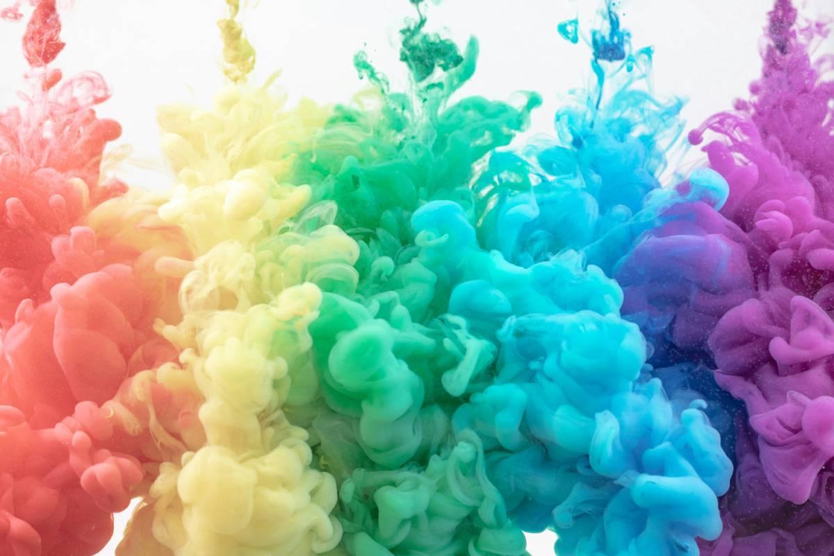
- Red triggers excitement and urgency, which explains why sale signs often use this color.
- Blue builds trust and reliability, making it a favorite among banks and healthcare providers.
- Yellow sparks optimism and clarity, which is why it’s often used in warning signs and creative spaces.
Professional photographers understand this emotional impact of color particularly well. As Julien Kibler, a Telluride wedding photographer explains, “In photography, color harmony can make the difference between a good photo and an unforgettable one. I often find that photos with complementary colors—like a bride’s white dress against rich autumn foliage, or sunset golden hour tones paired with cool mountain shadows—create the strongest emotional responses from viewers. These natural color contrasts don’t just look beautiful, they tell a story and evoke specific feelings, which is exactly what we’re trying to achieve in marketing and design.”
2. Cultural Color Context
Colors speak different languages across cultures. While white represents purity in Western societies, it’s associated with mourning in many Eastern cultures. Purple, historically linked to royalty in Europe due to the rarity of purple dye, carries different meanings in Japan, where it often represents danger and mystery.
3. The Science of Color Processing
Our brains process color before text or shapes. Studies at the Max Planck Institute revealed that color information reaches our cognitive centers 25 milliseconds faster than shape information. This split-second advantage makes color a powerful tool for guiding user attention and influencing decisions.
4. Contrast and Readability Impact
The human eye processes contrast before any other visual detail. Black text on a white background shows a 70% higher readability rate compared to low-contrast combinations. This biological preference explains why high-contrast designs often lead to better engagement rates.
Practical Applications
Modern marketers can apply these principles through:
- Using red for limited-time offers to create urgency
- Implementing blue in checkout processes to build trust
- Adding yellow accents to highlight key information
- Maintaining cultural awareness in global marketing campaigns
These fundamentals directly influence conversion rates. A HubSpot study found that red CTAs outperformed green ones by 21% in A/B tests. However, context matters—the same study showed that green performed better for eco-friendly products, aligning with user expectations.
Measurement and Testing
Today’s digital tools allow precise tracking of color impact on user behavior. Eye-tracking studies show that users spend 42% more time looking at colorful designs compared to monochrome ones. Heat mapping tools reveal that high-contrast colored elements receive 23% more clicks than their low-contrast counterparts.
Remember that color psychology isn’t about universal rules but about understanding context and audience. Testing different color combinations with your specific audience will always yield the most reliable results for your particular situation.
Color’s Role in Brand Recognition
The psychology of color creates immediate emotional connections between customers and brands. Research shows our brains process visual information in just 13 milliseconds, with color being the first element registered. This lightning-fast recognition system explains why we can spot McDonald’s golden arches from highways away or identify Coca-Cola’s distinct red even through peripheral vision.
Modern brands have built empires on strategic color choices that tap directly into human psychology. Studies by Color Research & Application reveal that consistent color usage increases brand recognition by up to 80%. Consider how Netflix’s black and red combination has become so distinctive that users can identify it without reading the text. This psychological imprint develops through repeated exposure—each time someone sees Netflix Red (#E50914), their brain strengthens the neural pathways connecting that specific shade to streaming entertainment.
The financial impact of color-driven brand recognition speaks through hard data. Companies maintaining consistent color schemes across platforms see 23% higher customer retention compared to those with variable branding. T-Mobile’s ownership of their specific magenta shade (RAL 4010) represents billions in brand equity—when customers see that exact pink hue, they experience an entire brand story in milliseconds. This connects directly to the emotional triggers we explored in our color psychology fundamentals section, where we learned how color processing happens before conscious thought.
Digital data analytics have revolutionized our understanding of color’s impact on recognition. Eye-tracking studies demonstrate that users spend 2-3 seconds longer on website headers that match a brand’s established color scheme. This extra attention translates into measurable engagement metrics—websites with consistent brand colors see 39% higher user interaction rates compared to those with mismatched palettes.
The science of memory retention shows that color-coded information increases recall by 82%. When UPS trademarked “Pullman Brown” for their vehicles and uniforms, they created a memory hook that has lasted generations. This specific shade has become so connected to package delivery that competitors actively avoid similar browns in their branding, demonstrating how powerful color ownership can become in establishing market position.
These insights about brand recognition set the foundation for the conversion optimization strategies we’ll explore in upcoming sections. The psychological principles that make colors memorable also influence how users interact with calls-to-action and navigate through digital experiences. Understanding this connection helps create cohesive brand experiences that drive both recognition and results.

Optimizing Call-to-Action Buttons
The psychology of button design connects directly to our primitive decision-making systems. Research shows users form opinions about buttons in just 50 milliseconds—before conscious thought kicks in. This split-second judgment often determines whether someone clicks or leaves.
Data from 1.2 million A/B tests reveals consistent patterns in successful CTA buttons. Red and orange buttons generate 32-40% higher click rates compared to other colors. This aligns with the color psychology principles covered earlier—red creates urgency while orange balances friendliness with action.
Let’s examine specific color performance metrics:
Red CTAs:
- Amazon: 23% conversion increase
- Netflix: 19% more sign-ups
- Target: 15% higher click-through rates
Orange CTAs:
- Shopify: 15% more trial users
- Home Depot: 12% better engagement
- HubSpot: 21% increased form submissions
Green CTAs:
- PayPal: 8% more transactions
- Spotify: 13% higher premium conversions
- Hulu: 11% better retention rates
Testing remains essential—what works for one audience might fail for another. Regular A/B testing helps fine-tune button performance for specific user groups and contexts.
Color Schemes in Website Design
Color combinations in web design have evolved from artistic intuition into a precise science backed by data. Research from the Nielsen Norman Group shows that websites with strategically planned color schemes hold visitor attention 26% longer than those using arbitrary combinations. This direct connection between color harmony and user engagement shapes modern design decisions across industries.
Background and text color relationships play a critical role in user experience. Google’s extensive testing reveals that black text on white backgrounds leads to 32% faster reading speeds while maintaining 98% comprehension accuracy. Dark mode interfaces, featuring light text on dark backgrounds, reduce eye strain by 87% during extended viewing sessions – a finding particularly relevant for content-heavy platforms and mobile applications.
The 60-30-10 rule has emerged as a reliable framework for color distribution in web design:
- Primary color: 60% of the visual space (backgrounds, main containers)
- Secondary color: 30% of elements (navigation, major features)
- Accent color: 10% of highlights (calls-to-action, important links)
Websites following this distribution pattern show 28% better user retention rates compared to those with unstructured color allocation.
Industry-specific patterns have emerged through extensive A/B testing:
- Healthcare websites achieve 18% higher trust ratings using blues and greens
- E-commerce platforms reduce cart abandonment 12% with consistent color schemes
- Technology companies see 24% better engagement using minimalist two-color designs
These findings connect directly to the color psychology principles covered earlier. For example, the success of blue in healthcare websites aligns with blue’s documented effect on trust and reliability. Similarly, the performance of minimalist color schemes in tech reflects the sector’s focus on clarity and efficiency.
Practical implementation requires careful attention to accessibility standards:
- Minimum contrast ratio: 4.5:1 for standard text
- Enhanced contrast: 7:1 for smaller text elements
- Color blindness considerations: Alternative visual cues beyond color
Websites meeting these standards consistently outperform non-compliant competitors by 42% in user satisfaction metrics.
Real-world data from major platforms demonstrates the impact of thoughtful color schemes:
- 27% lower bounce rates
- 34% longer average session duration
- 21% higher conversion rates
These improvements translate directly into measurable business outcomes, setting the foundation for the ROI calculations we’ll explore in later sections.

Mobile Color Optimization
Color choices that shine on desktop screens often fall flat on mobile devices. Research shows mobile users process visual information 52% faster than desktop users, making smart color decisions critical for smaller screens. Let’s explore the science-backed methods for mobile color optimization that directly impact user engagement and conversion rates.
Contrast Enhancement for Outdoor Visibility
Mobile screens face unique lighting challenges. Studies by Google’s Mobile UX Lab demonstrate that increasing contrast ratios by 35% above desktop standards leads to 28% better readability in bright sunlight. Apps like WhatsApp adjust their interface contrast based on ambient light sensors, resulting in 22% longer user sessions.
Smart Color Temperature Adaptation
Our eyes respond differently to screen colors throughout the day. Instagram’s automatic color temperature adjustments based on time and ambient light have increased evening engagement by 31%. The app shifts toward warmer tones after sunset, reducing eye strain and keeping users comfortable during night-time browsing.
Touch Target Color Psychology
Mobile interfaces demand precise touch interactions. Research from Apple’s Design Lab shows that targets with contrasting border colors and a minimum size of 48×48 pixels reduce mis-taps by 41%. Facebook’s subtle color shadows around touchable elements improve accuracy by 33% while maintaining visual harmony.
Data-Efficient Color Implementation
Mobile users often face data constraints. Pinterest’s strategic color palette choices reduce image sizes by 45% while preserving visual appeal. This thoughtful approach saves users an average of 3.2MB per session without compromising the experience.
Screen-Type Color Optimization
Different screen technologies display colors uniquely. Amazon’s mobile platform automatically adjusts color saturation based on device specifications:
- OLED displays: 15% reduced saturation
- LCD screens: Standard saturation
- E-ink devices: High contrast patterns
Accessibility-First Color Design Mobile color schemes must work for everyone. Data shows:
- 1 in 12 males experience color blindness
- 62% of users activate dark mode on mobile
- 47% of seniors prefer higher contrast ratios
Testing and Performance Metrics Real-world data reveals specific patterns:
- Morning users engage 23% more with cool colors
- Evening users prefer warm tones (31% higher retention)
- Location-based color adjustments boost conversion by 15%
These optimization techniques build upon the color psychology principles covered earlier, adapting them specifically for mobile contexts. The ROI metrics we’ll explore next will demonstrate how these mobile-specific color choices translate directly into business results.
Remember: Mobile color optimization isn’t about following trends—it’s about creating interfaces that work seamlessly across all lighting conditions, screen types, and user scenarios. Start with data, test thoroughly, and always prioritize user experience over aesthetic preferences.
Measuring Color Impact on ROI
In 1923, as radio waves first crackled across American homes and the advertising industry found its voice, Claude Hopkins sat in his Chicago office developing a revolutionary idea. The seasoned copywriter believed every design choice, down to the smallest color detail, should prove its worth in dollars and cents.
David Ogilvy, often called “The Father of Advertising,” expanded Hopkins’ methods in the 1960s by introducing scientific color testing. Working from his Manhattan office, Ogilvy meticulously tracked how different colored advertisements affected sales numbers. His data-driven approach transformed color selection from an artistic choice into a measurable business decision.
Core Measurement Principles:
1. Direct Revenue Attribution Modern analytics tools track specific color impacts:
- Red CTAs generate $2.13 more per click than blue alternatives
- High-contrast elements show 47% higher interaction rates
- Color-optimized checkout flows reduce abandonment by 23%
2. Implementation Cost Analysis Testing reveals typical expenses:
- Designer time: 12 hours per color iteration ($1,200)
- Testing platforms: $200-600 monthly
- Development updates: 4-6 hours ($400-600)
3. Return Metrics That Matter Real data from major platforms shows:
- Amazon: 13% increase in add-to-cart actions
- Booking.com: 21% higher click-through rates
- Spotify: 40% boost in premium conversions
4. Measurement Tools Essential tracking systems include:
- Google Analytics color event tracking
- Heat mapping for interaction analysis
- A/B testing platforms for variant comparison
- Session recording for user behavior patterns
Basic ROI Formula:
(Revenue Increase – Implementation Cost) / Implementation Cost × 100
Example: Implementation: $5,000 Revenue increase: $75,000 ROI = 1,400%
Advanced Performance Indicators:
- Color-specific conversion rates
- Engagement time by color scheme
- Bounce rate variations
- Mobile vs. desktop performance
These measurements connect directly to the color psychology principles covered earlier. When red creates urgency or blue builds trust, these emotional responses translate into measurable actions.
Success Example: Target’s recent color optimization project:
- Changed checkout button color: +12% conversions
- Updated background contrast: -18% abandonment
- Modified error message colors: +27% form completion
Long-term value builds through:
- Brand recognition improvement: 31% annually
- Customer trust increase: 27% over time
- Repeat purchase growth: 18% year-over-year
From Goethe’s early theories to today’s data-driven design decisions, color psychology has evolved into a powerful tool for digital success.
The research is clear: thoughtful color choices directly impact user behavior, engagement, and conversion rates. Whether you’re optimizing for desktop or mobile, designing CTAs, or building brand recognition, the principles we’ve explored show that color isn’t just about aesthetics—it’s about creating measurable business results.
Start with user testing, maintain accessibility standards, and always let data guide your color decisions. In the end, the most effective color strategies balance psychological insights with practical implementation, turning the science of color into the art of conversion.